Stephen Gooden is well enough known to have found a place in all the standard dictionaries of book illustrators, so I give only an outline sketch of his life here.
Born in London in 1892 he attended the Slade School of Fine Art from 1909 to 1913. He was to become best known for his fine engravings (1a), mostly on copper, many of which featured in his book illustrations, as we shall see. He also produced numerous bookplates, many for the rich and famous of the day (1b), as well as working on bank note designs, notably for the blue English £5 note issued in 1957 (1c). In 1922 he met Mona Steele Price, who had published a small collection of her poems a few years before, and was at that time an assistant librarian at Birkbeck College, London. They married in 1925. While her husband worked on his book illustrations, many for the Nonesuch Press, she pursued a career of literary criticism and translations of French poets (she had studied English and French literature at Trinity College Dublin, from which she graduated in 1916.) The marriage seems to have been a happy one, lasting until he died in 1955. She followed him in 1958.
Gooden was elected as an Associate of the Royal Society of Painter–Etchers and Engravers in 1931, and a Fellow of the same in 1933; an Associate of the Royal Academy in 1937, and a Fellow of the same in 1946. He was awarded a CBE in 1942 (1d).
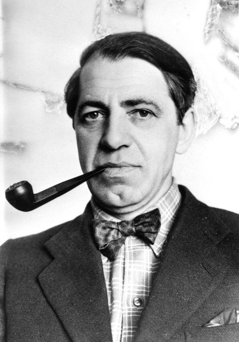
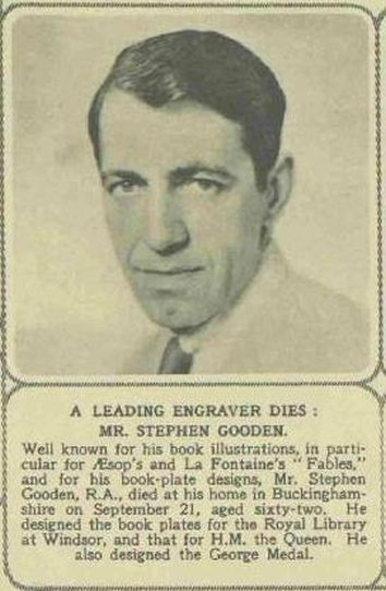
A press photograph of him in a somewhat dapper mode, dating from the late 1940s, is shown in Fig.1a. A rather later photograph (Fig.1b) accompanied a short obituary of him published in The Illustrated London News on 1 October 1955 (p.31.) A lengthier obituary appeared in The Times on 22 September 1955 (p.12, col.3.) Such by then was his fame.
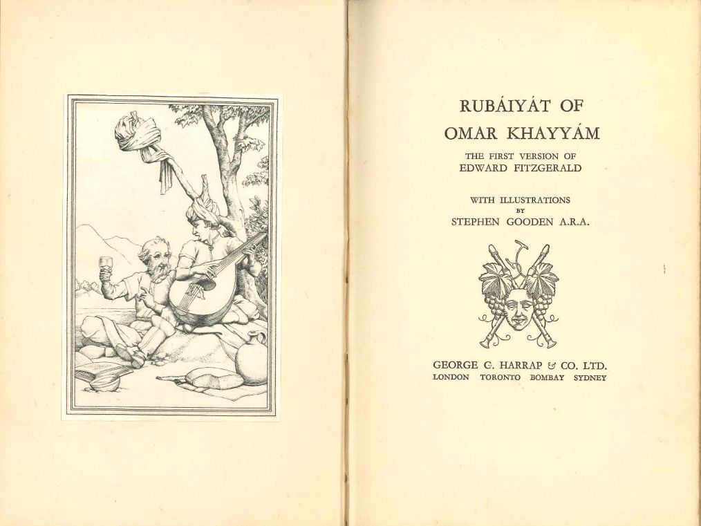
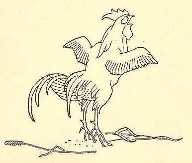
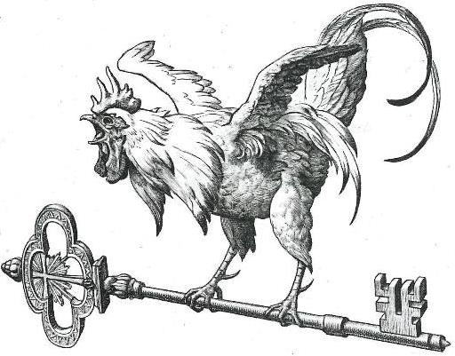
In 1940 George G. Harrap & Co. Ltd. published an edition of FitzGerald’s first version of The Rubaiyat, illustrated by Gooden, with a short anonymous Foreword (Coumans #63; Paas ##2423–36.) Its four full–page illustrations and four vignettes / decorations are shown here, in the order in which they occur in the book, as Figs.2a, 2b, 2c, 2d, 2e, 2f and 2g. [Browse here.] The dawn cockerel headpiece to quatrain 1 (Fig.2b) and the turned–down empty glass tailpiece to quatrain 75 (Fig.2f) require no explanation. Likewise the title–page decoration (Fig.2a), with its smiling mask, crossed–flutes and bunches of grapes, would seem to be an apt forerunner of the lighter side of the verses to follow. The frontispiece (Fig.2a), too, is an obvious nod towards the famous quatrain 11, with the loaf of bread, the flask of wine, the book of verse, and Omar’s Beloved singing beneath the bough. But it is unusual in that Omar’s Beloved is rather plain, shall we say, somewhat masculine even, in comparison to the glamorous, scantily clad and sometimes naked young women so often depicted by other artists. (As we shall see, this was not because Gooden was averse to depicting nudes.) Even quirkier is the fact that Omar has taken his turban off and hung it from the end of the bough, revealing a balding head!
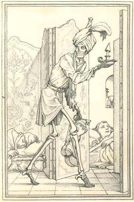
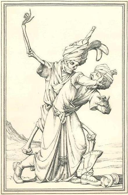
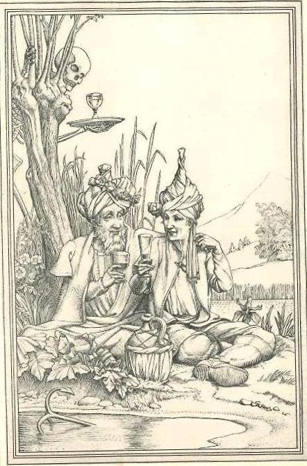
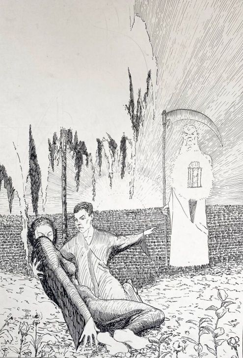
Stranger still is that the other three full–page illustrations, all of which feature the figure of Death, are of a very different nature to the frontispiece, and seem to bear no direct relation to any particular quatrain. Rather they appear to be generic references to the theme of mortality which runs through FitzGerald’s verses. They represent, I think, three types of death.
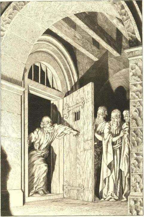
Fig.2c seems to relate to dying in one’s sleep. Death, wearing a turban and having taken off his boots (!), tiptoes cautiously by, presumably heading for his next victim. His candle–holder, like the background sleepers, indicates night, and the key which he holds, I would guess, symbolises that no door is locked to him.
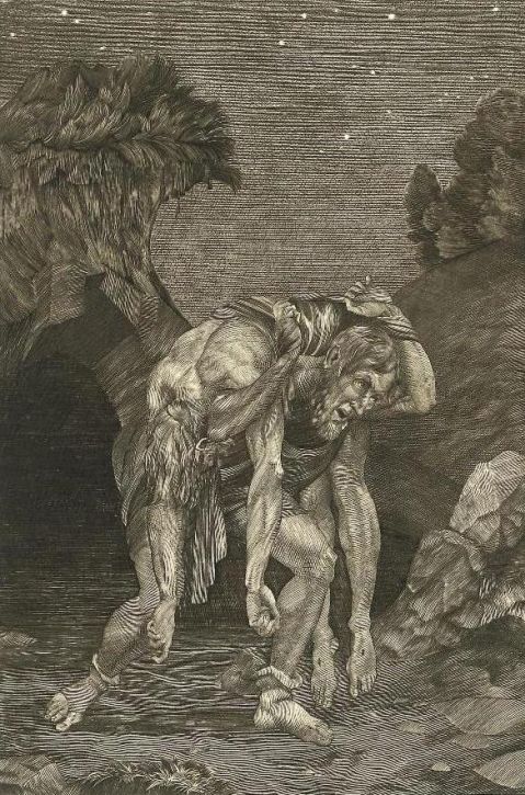
Fig.2d seems to relate to sudden unexpected death – note the upset wine glass to the lower right, and the fact that Death, again wearing a turban, is now wearing the boots he carried in Fig.2c.
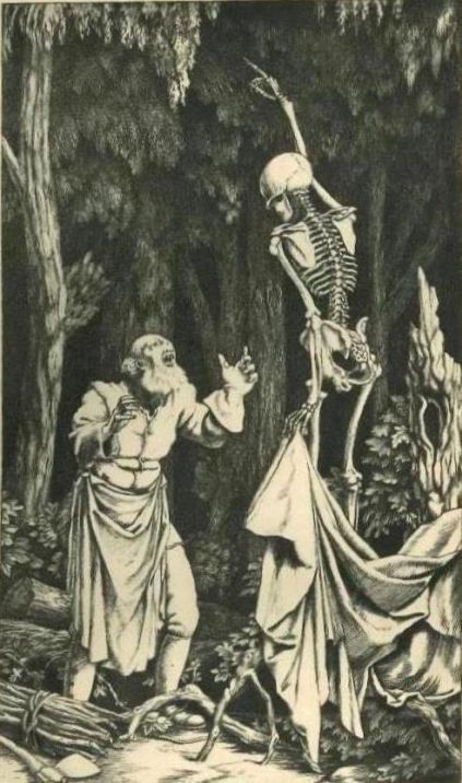
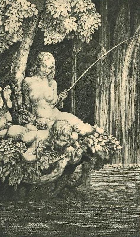
Fig.2e seems to relate to the fact that Death is forever lurking in the background. Here he carries a glass of wine on a tray, but unlike the two previous illustrations, he is not wearing a turban. The two foreground figures are presumably Omar and his Beloved, a jug of wine before them, and, somewhat curiously, there is an anchor (or grappling iron ?) half submerged in the pool before them. It is not clear what this is meant to indicate, though it perhaps represents what so precariously anchors the soul to the earthly plane. Another possibility is that the anchor is here used as a symbol of the strength of Omar’s relationship with his Beloved, this being threatened by their inevitable separation at death. It has been suggested, given Omar’s baldness in Fig.2a and the implication in quatrain 74 (“Ah, Moon of my Delight &c”) that Omar will die before his Beloved, that Fig.2e is perhaps also age–related. Be that as it may, the anchor appears again in the next illustration.
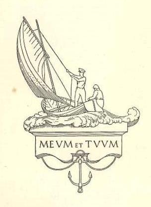
Fig.2g depicts a boat with two sailors, with the inscription MEVM ET TVVM below, and an anchor hanging below that. As fans of FitzGerald well know, “Meum et Tuum” was the name of a fishing boat owned by FitzGerald in partnership with ‘Posh’ Fletcher, the name being indicative of that joint ownership. But why use that image here ? Does the boat with anchor (cf Fig.2e), together with a reading of “meum et tuum” as “me and you”, indicate the mortal nature of all of us on the Sea of Life, or is that to read too much into it ? Does the anchor here have anything to do with the strength of feeling of FitzGerald for Fletcher ? Or is it just a decorative anchor with no symbolism at all ? I leave readers to decide for themselves.
[The illustrations can be browsed here.]
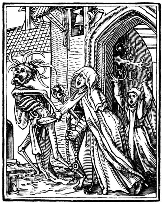
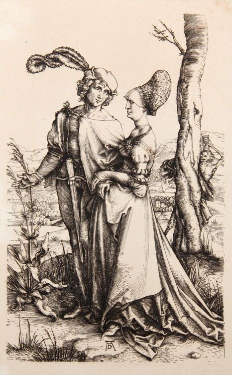
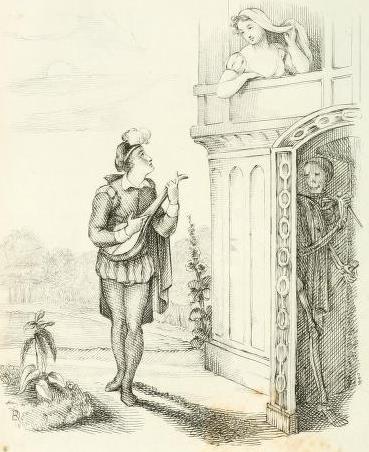
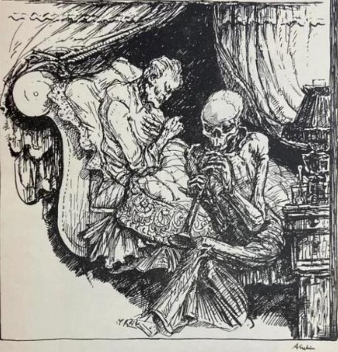
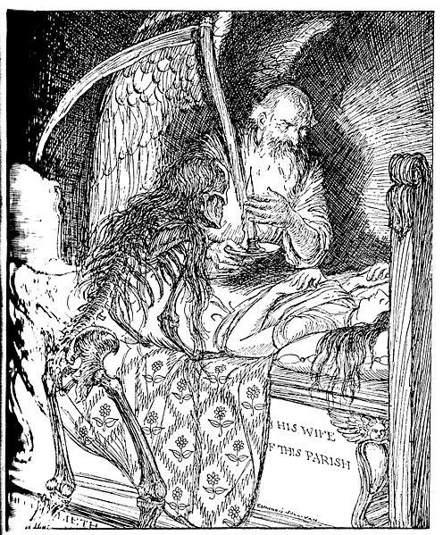
Gooden’s set of three Death illustrations – with the emphasis on “set” – rather reminds me of the Dance of Death sets of engravings and woodcuts so popular from the sixteenth century onwards, though without the usual moral message. The 41 woodcuts by Hans Holbein the Younger in The Dance of Death, first published in 1538, is the most famous example, depicting the ever present threat of Death in a wide variety of contexts – young and old, rich and poor. Thus Fig.2d reminds me of Holbein’s woodcut “The Abbess”, shown in Fig.3a, a reminder that even the most pious can be snatched away by Death. Again, Fig.2e reminds me of Dürer’s engraving “Death and the Lovers” (1498), shown in Fig.3b, which though not one of a set, is nevertheless of the type – one of Holbein’s woodcuts shows a similar couple openly confronted by Death, for example, the message being that all too soon the lovers will be separated by death. There is also Richard Dagley’s much later print on the same theme, “The Serenade” (1827), shown in Fig.3c, one of a set of 30 Dance of Death prints published under the title Death’s Doings, of which more later. But Fig.2c does not find a ready parallel in the likes of Holbein, and the figure of Death does feature regularly and naturally in many an illustrated edition of The Rubaiyat, without any intended Dance of Death connotations. Indeed, Fig.2e also recalls the “darker Draught” of quatrain 48, though that is delivered by an Angel, rather than Death, and the Angel form is generally adopted by Rubaiyat artists – Elihu Vedder, Herbert Cole and Edmund Dulac, for example. But then Edmund J. Sullivan illustrated quatrain 48 with a winged skeletal figure – presumably intended as the Angel of Death. So, was Gooden influenced by the art of the Dance of Death, or was there some other source of inspiration? We shall return to that question later. [Browse here.]
Meanwhile, I was intrigued to find that similar thoughts on Gooden’s Rubaiyat had been expressed by an anonymous reviewer in Truth on 6 December 1940 (p.15), shortly after the book had first appeared (in October):
Mr Gooden’s illustrations to Omar are macabre, in the tradition of Holbein through Beardsley. It is a pleasing contrast to those recent editions which have revelled in very Western nude young ladies rather than Eastern symbols of the old Persian. The test is from the first edition. The volume slides pleasantly into the side pocket.
A deluxe limited edition of 125 copies of Gooden’s Rubaiyat, all signed by the artist and specially bound, was issued by Harrap in the same year. The illustrations in the deluxe edition were engravings, those in the regular were smaller tipped–in copies of them, their positions in the text being slightly different. Effectively the deluxe edition contained all the same illustrations, and so adds nothing to the foregoing account. The trade edition was reprinted at least twice, in 1945 and 1947.
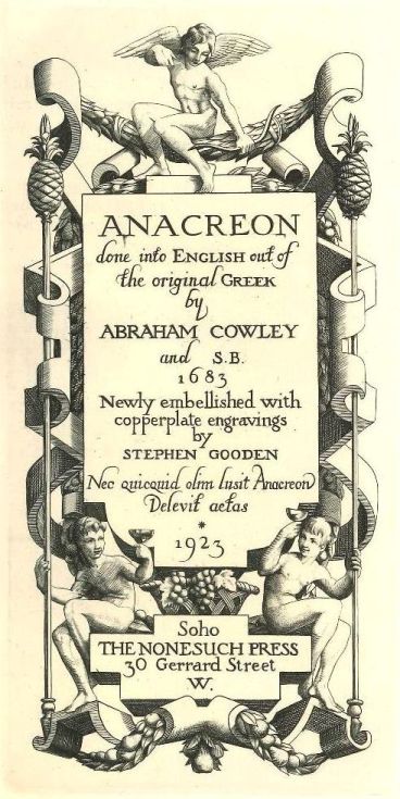
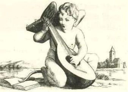
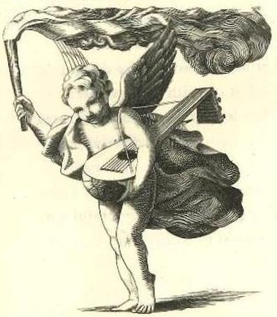
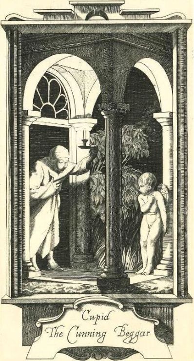
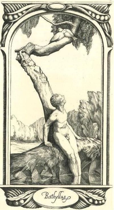
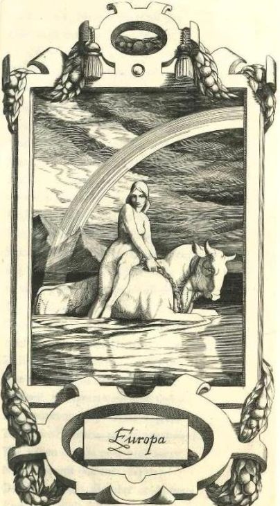
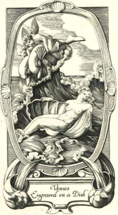
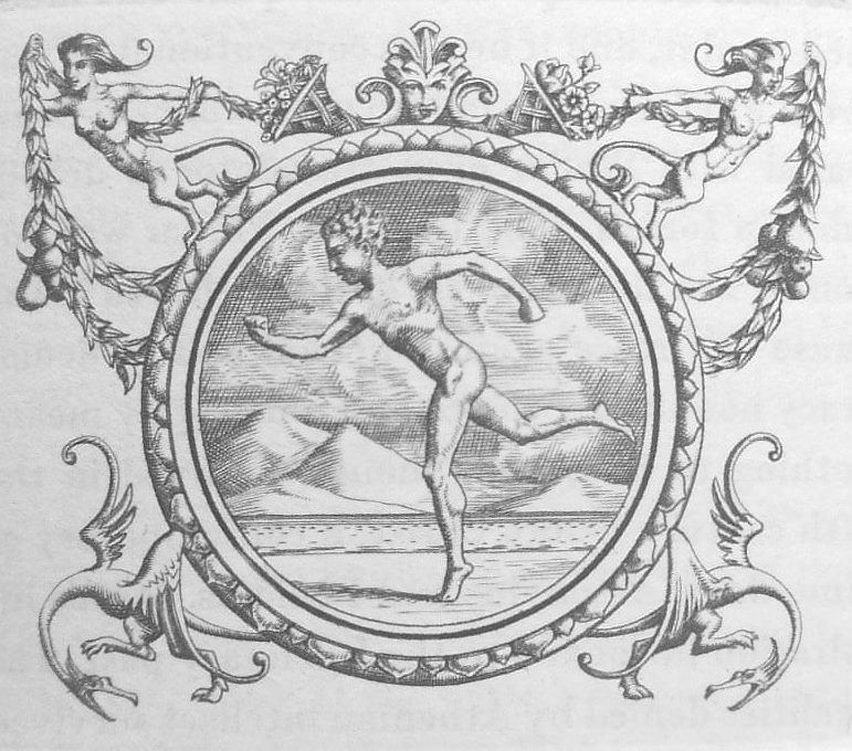
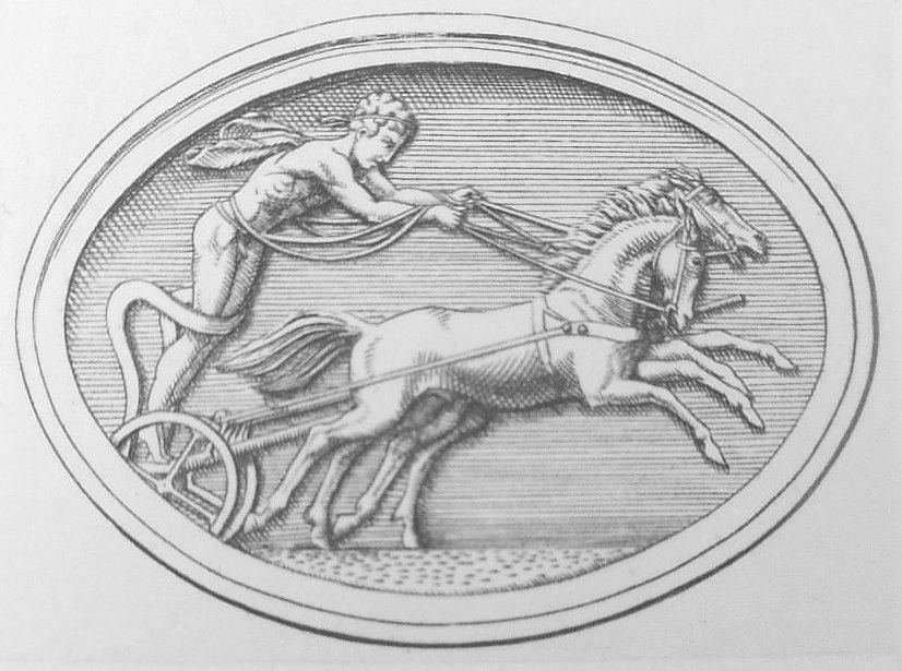
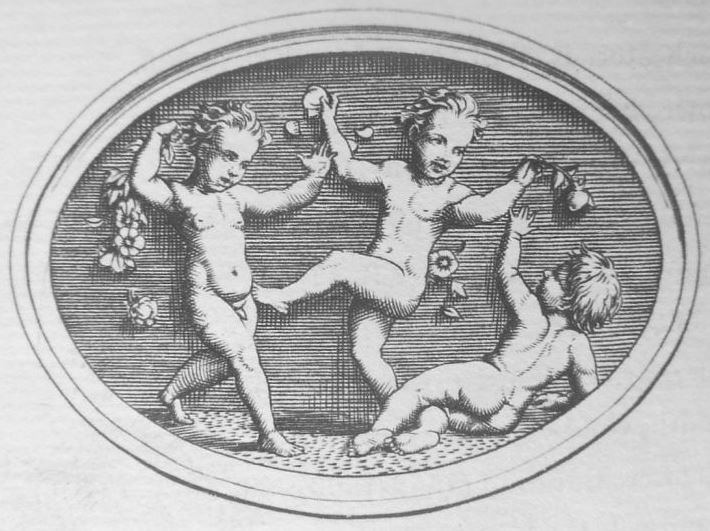
The first book which Gooden illustrated seems to have been Anacreon, the collected odes of the so–called Greek poet of Love and Wine, published by the Nonesuch Press in 1923, for which he designed the impressive title–page (Fig.4a), a headpiece for the first ode (Fig.4b), a tailpiece for the last ode (Fig.4c), both featuring Cupid, and four full–page illustrations. These are shown here as Fig.4d (“Cupid the Cunning Beggar” – Ode 3), Fig.4e (“Bathyllus” – Ode 26), Fig.4f (“Europa” – Ode 32) and Fig.4g (“Venus engraved on a Dish” – Ode 48.) [Browse here.] Anacreon lived in the sixth century BC, so the love of pretty boys, which features in the first two of these odes, was as normal as the heterosexual love which features in the second two (one recalls the pretty boy sakis or wine servers of Omar’s day.) Anacreon also, along with Omar, enjoyed a drink or three with a carpe diem disregard for the wealth of kings and unborn tomorrow. The following is Ode 14, “The Drunkard”, in full:
Fill the bowl with rosie wine,Around our temples roses twine,And let us cheerfully a while, Like the wine and roses smile.Crown’d with roses we contemnGyges wealthy diadem. To–day is ours, what do we fear,To–day is ours, we have it here.Let’s treat it kindly that it may Wish at least with us to stay.Let’s banish business, banish sorrow,To the gods belongs tomorrow.
Actually, death and mortality do also feature in the odes, as in Ode 22, “Life”, which talks of “The slippry road of life, which men / Once pass, and nere begin ag’en” and “when Death takes the trav’lers in, / Tis hidden, sacred, and unseen”, the remedy for which is to “Fill up the bowl we’ll dance and sing / Till Nature does true knowledge bring.”
It is interesting, given the parallels between Anacreon and Omar, that Gooden took such a different approach to the two in his illustrations, but then his Anacreon and his Rubaiyat were separated by nearly two decades, and a lot can happen in that time. Plus, of course, the two were done for different publishers.
It is also interesting to note that probably only a small proportion of the 52 Odes in the Nonesuch Press edition are actually by Anacreon. Like Omar, his surviving work has been much added to by later imitators.
Following Anacreon, Gooden went on to illustrate / decorate another nine books for the Nonesuch Press (2).
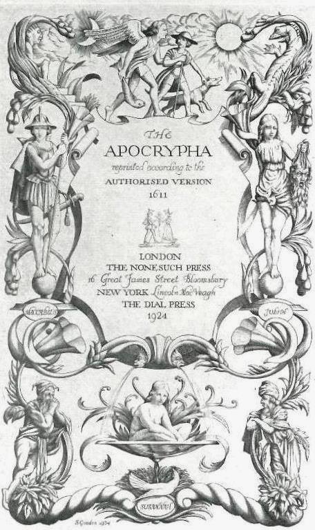
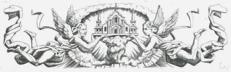
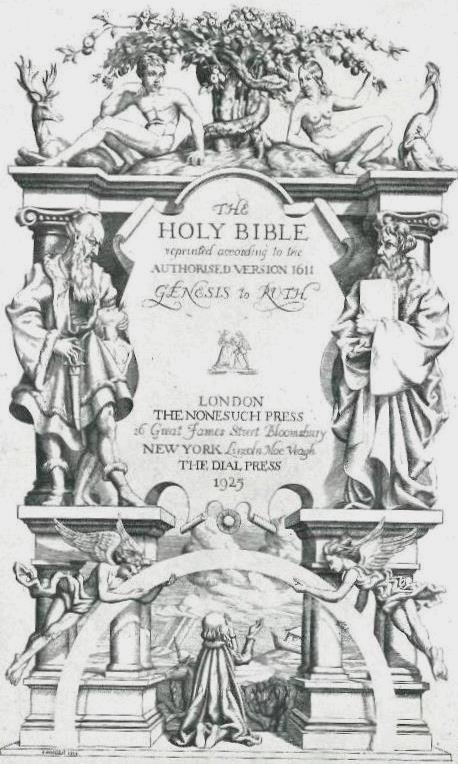
In 1924 he did the title–page (Fig.5a), the headpiece on the opening page (Fig.5b), and the tailpiece on the closing page (Fig.5c), of The Apocrypha. In the same manner he decorated The Holy Bible in four volumes, the first three covering the Old Testament and the fourth the New. Fig.6a shows the title–page to vol. 1 (cf. Fig.5a) and Fig.6b shows the tailpiece to vol.4, depicting the Whore of Babylon seated on the seven–headed beast from the “Book of Revelation” (Rev.17.5) – this last is far and away the most imaginative of Gooden’s biblical illustrations.
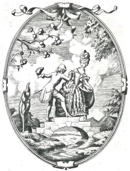
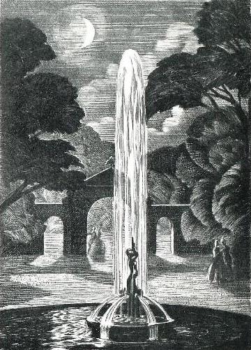
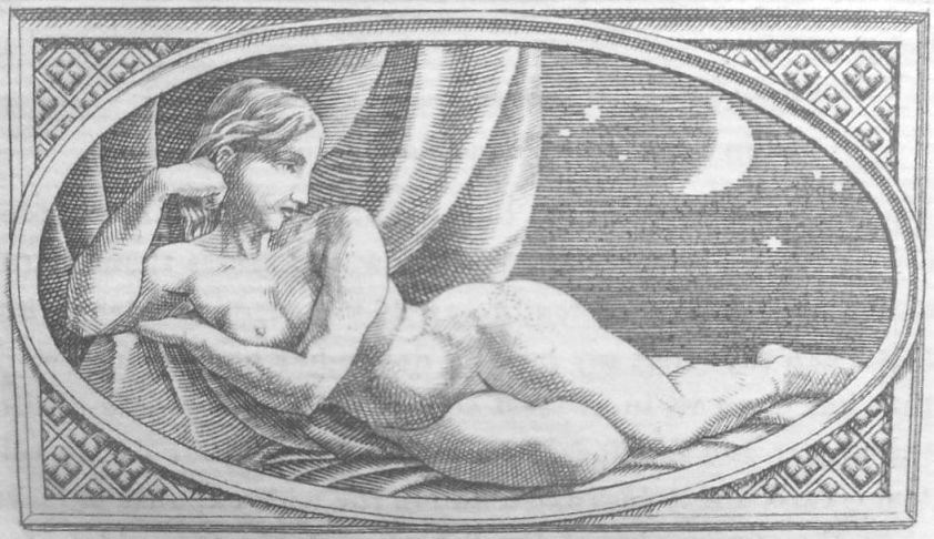
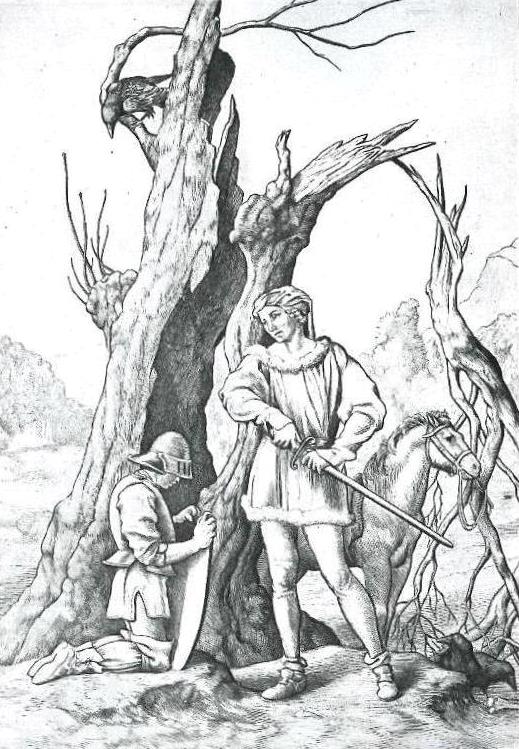
In 1925 Gooden did the vignette on the title page of an anthology of eighteenth century songs popular in the London Pleasure Gardens of the day, Songs of the Gardens (Fig.7). It was edited by Peter Warlock. In the following year, he did the frontispiece for George Moore’s Celtic historical romance, Ulick and Soracha (Fig.8.) These were followed by Anatomical Exercises of Dr. William Harvey (1928), for which he did one anatomical plate; Pindar: the Pythian Odes (1928) for which he did the title–page design, headpiece (Fig.9a) and tailpiece (Fig.9b); The Latin Portrait (an anthology of Latin poems with English translations, compiled by G. Rostrevor Hamilton) (1929), for which he did the title–page design, headpiece (Fig.10a) and tailpiece (Fig.10b); and George Moore’s (unfinished) essay, A Communication to my Friends (1933), for which he did the Nonesuch Press logo on the title–page. Next comes George Moore’s adaptation of a Breton folk–tale, Peronnik the Fool (1933), for which he did the frontispiece, the title–page design, four headpieces (Fig.11a is that for chapter 3), a tailpiece, and two full–page illustrations (Fig.11b being the one showing Peronnik and Sir Gilles (3a).) This seems to have been the last book he illustrated for the Nonesuch Press, and readers will note the prominence of the name George Moore! All of these illustrations / decorations are technically very accomplished, of course, and with the exception of Fig.6b (whose imagery is supplied by Revelation 17.5, and which has been illustrated by numerous artists down the years) are rather conservative in their treatment of their subject matter. There is no clue here as to where his Rubaiyat illustrations came from. Incidentally, it is a noticeable fact that the Nonesuch Press never published an edition of The Rubaiyat. According to Dreyfus (2) they avoided “work so repeatedly reprinted by private presses in England and abroad, such as Aesop, Bacon, Daphnis and Chloe, Omar Khayyam, or separate printings of Ecclesiastes and The Song of Songs” (p164).
[The illustrations can be browsed here.]
In 1929, William Heinemann Ltd. of London, in parallel with the Macmillan Company of New York, published an edition of George Moore’s long and controversial novel based on the life of Christ, The Brook Kerith (3b). It featured 12 engravings by Gooden, of which 9 were full page illustrations, and to understand them involves knowing something of the plot of the novel.
Basically the story revolves around the premise that Christ did not die on the cross, but was rescued by Joseph of Arimathea, nursed back to health, and taken for safety to the remote Essene community at Brook Kerith. Twenty years on, after widespread preaching of the Gospel, based on the Death and Resurrection of Christ, the Apostle Paul visits the community and inevitably meets the very Christ who is supposed to be with his Heavenly Father, not here on Earth. Christ, who was unaware of Paul’s work in spreading his teachings, confesses that all those years ago he had started to believe that he really was the Messiah, but that it was all madness – he was just an ordinary man. Paul can’t decide whether this Jesus is a madman or a demon sent to deceive him, but clearly if the real Christ is still alive, all his preaching of the Gospel has been in vain, and if the truth comes out, the world will revert to paganism. At first Jesus wants to go to Jerusalem to confess, but in the end he stays in Kerith, and Paul continues on his mission, believing, in effect, that the end justifies the means.
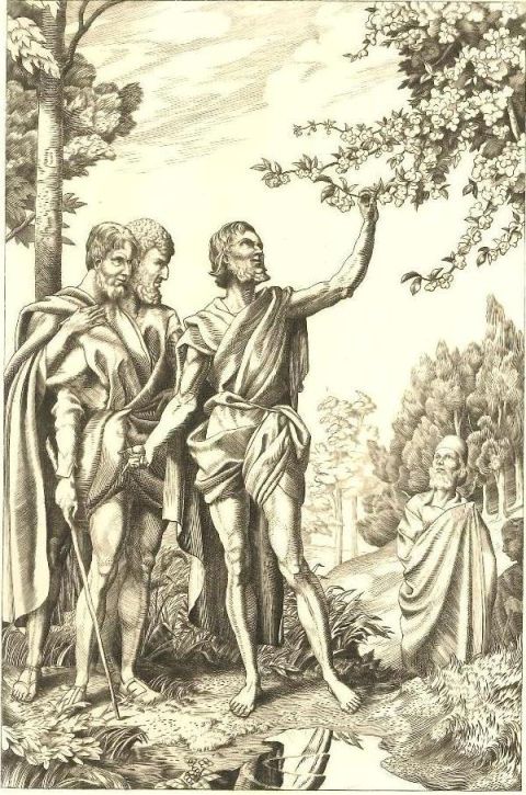
Fig.12a shows Christ delivering the Parable of the Fruit Tree (Luke 13.6–9); Fig.12b shows Joseph of Arimathea removing the near dead Christ from the tomb; and Fig.12c shows Paul meeting Jesus at Kerith. The illustrations, then, adhere closely to the text, and again, though highly accomplished, they have the overall appearance of the illustrations of a Victorian Bible. [Browse here.] Given the controversial nature of the novel, it would be interesting to know what Gooden himself thought of Moore’s premise, but alas, no information is available.
In 1931, William Heinemann Ltd. of London published a two volume edition of The Fables of Jean de La Fontaine, translated into English verse by Edward Marsh, and illustrated with 26 engravings by Gooden. In 1933 they issued an abridged one volume edition containing 12 of the engravings.
Fig.13a illustrates “Death and the Woodman”, whose moral in the last four lines is:
Death can take all ills away;But here we are, and here would stay.Better to suffer than to die Is Everyman’s Philosophy.
This illustration, of course, is another Dance of Death type and a precursor to the figures of Death in his Rubaiyat illustrations, though less subtle.
Fig.13b illustrates “The Swan and the Cook”, the tale of a tipsy cook who, in searching for something for the cooking pot, mistakes a swan for a goose, but realises his mistake when the swan sings its swansong.
Fig.13c illustrates “The Acorn and the Pumpkin”, and shows “the pensive Bumpkin” puzzling over God&rsqu;s contrasting designs for the acorn and the pumpkin (which of course rhymes with bumpkin.)
Fig.13d illustrates “The Fishes and the Flute Player”, and shows the shepherd Thyrsis and the maid Annette, she fishing with a line, he attempting to woo the fishes with a flute. Neither succeeds until they use a net.
These illustrations are much more imaginative, of course, but then so is the text which Gooden is illustrating. [Browse here.]
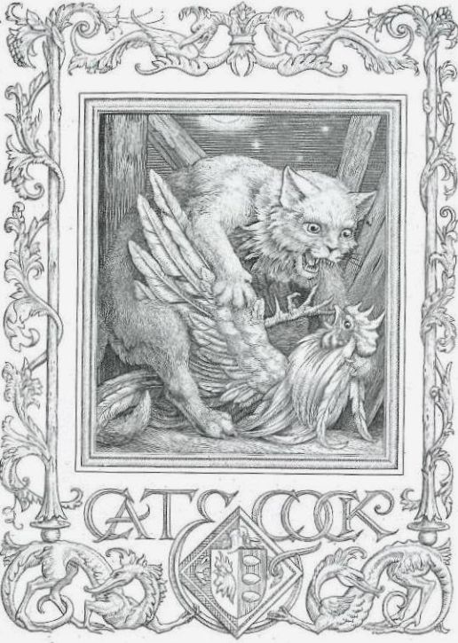
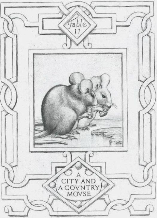
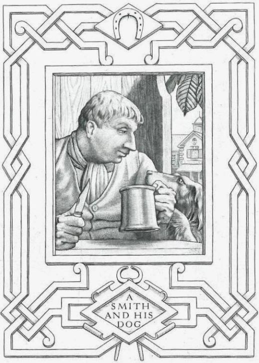
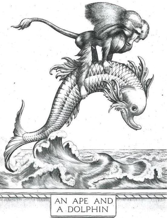
In 1936 George G. Harrap & Co. of London published an edition of Aesop’s Fables translated by Sir Roger L’Estrange Kt., with 12 engravings by Gooden. I reproduce 4 of them here.
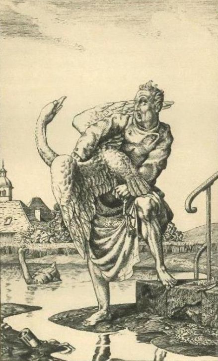
Fig.14a illustrates “A Cat and a Cock”; Fig.14b illustrates “A City Mouse and a Country Mouse”; Fig.14c illustrates “A Smith and his Dog”; and Fig.14d illustrates “An Ape and a Dolphin.” (The last of these perhaps merits some explanation. It is the story of a dolphin who rescued an ape from a shipwreck believing the ape to be human. The ape pretended to be human, but gave itself away, whereupon the dolphin ditched him and headed back to the shipwreck to rescue a real human.)
The most striking thing about these illustrations is Gooden’s skill in depicting animals, other than that the same comment applies here as to the fables of La Fontaine. [Browse here.]
Aesop’s Fables was the first book to be illustrated by Gooden for Harrap, and indeed, after 1936 he appears to have illustrated books for no other publisher.
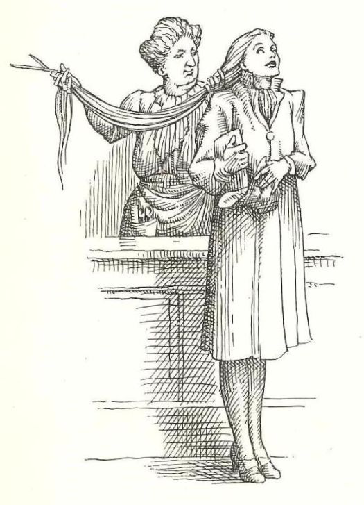
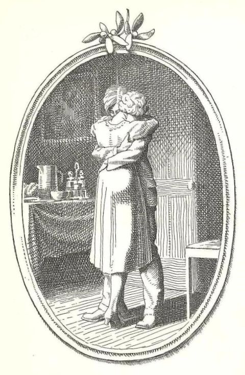
The year 1939 saw him illustrate, for Harrap, O. Henry’s short story The Gift of the Magi, not a re–telling of the New Testament story of the birth of Christ, but a tale of the true spirit of Christmas, featuring a couple Della and Jim, who have fallen on hard times. Della sells her hair to a wig–maker to buy Jim a gold watch chain for Christmas, only to find that Jim has sold his watch to buy her a set of tortoiseshell combs for her hair. Fig.15a shows Della having her long hair cut off and Fig.15b shows the couple embracing at the end of the story.
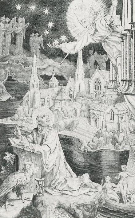
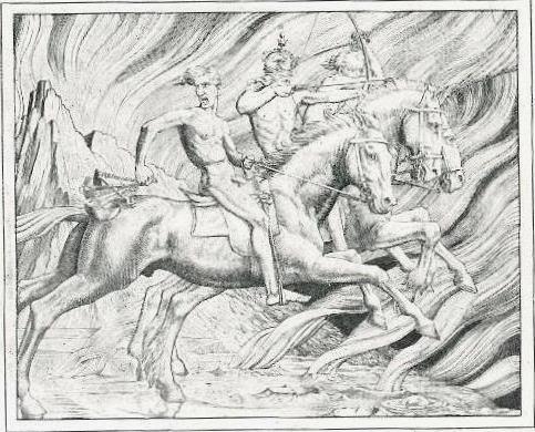
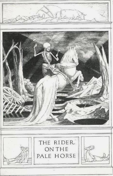
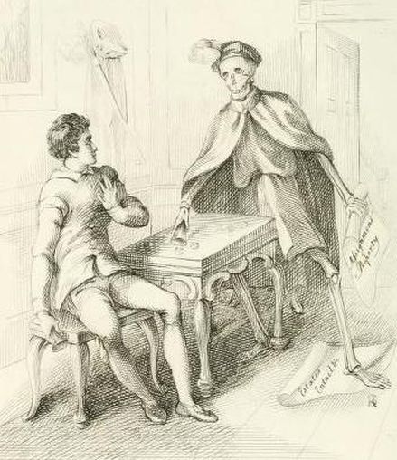
Gooden’s next book for Harrap was to have been an edition of The Revelation of St. John the Divine, but it seems never to have been published. He had worked on it since 1938, but seems to have completed only three illustrations before the project was abandoned. These were: Fig.16a, showing St. John receiving the Revelation at Patmos (Rev.1.9); Fig.16b, showing the first three of the Four Horsemen of the Apocalypse (Rev.6.2–5) and Fig.16c, the fourth of the Horsemen, the Rider on the Pale Horse (Rev.6.8.) The first three horsemen, going back to front in Fig.16b, are generally reckoned to symbolise War (he wields a sword), Conquest (he wears a crown and holds a bow) and Famine (he clutches a pair of scales.) The fourth horseman, in Fig.16c, is named in the text as Death. Though the book was never published, fifty sets of prints of the three illustrations were produced for sale as a very limited edition, and one which is now, predictably, extremely rare (4). Fortunately images of them are preserved in Campbell Dodgson’s Iconography (1e).
The next book for Harrap, of course, was The Rubaiyat of 1940. It would be interesting to know why The Rubaiyat went ahead, whereas the edition of Revelation did not. It can hardly have been just because of the Second World War, for we know from the dated signatures beneath the original engravings as pictured in Dodgson that those for Revelation were actually done in 1938–9 but those for The Rubayat not until 1940 itself, the year of publication. Plus Gooden was associated with two other works published by Harrap during the War. The first, published in association with the Royal Society of St. George, was George Rostrevor Hamilton’s patriotic poem, The Trumpeter of St. George (1941), whose frontispiece (Fig.17) had actually been done by Gooden back in 1924 (1f). The second was Poems from the Desert (1944), a collection of 27 poems written by soldiers of the eighth army, with a Foreword by General Montgomery, for which Gooden did the frontispiece (Fig.18.) It is to be noted, though, that the frontispiece of the latter appeared only in its limited edition of 110 copies, not in the commonly encountered trade edition.
Gooden was too old to join up in the Second World War, though he did serve in the First World War, enlisting in the army as a private in 1914, and serving in France for three years. His only graphic acknowledgment of this seems to be an engraving of himself mounted on a horse and lighting his pipe (Fig.19), with a (symbolic ?) rainbow in the background. When the engraving was done is not clear, but it was used on the title page of The Legion Book, edited by Captain H. Cotton Minchin, printed for the Prince of Wales in 1929, in a limited edition of 100 copies (1g). It is to be noted though that this frontispiece did not appear in the trade edition of the book published by Cassell & Co. in the same year.
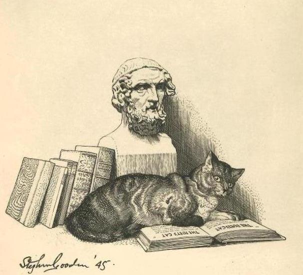
But to get back to Harrap, the last book published by Harrap with which Gooden was associated was The Poet’s Cat (1946), an anthology of poems about cats, ancient to modern, compiled by Mona Gooden, his wife. For this he did the frontispiece shown here as Fig.20.
After these various frontispieces, it comes as a bit of a surprise to realise that the last book fully illustrated by Gooden was his Rubaiyat, to which we now return.
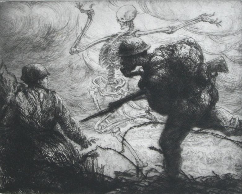
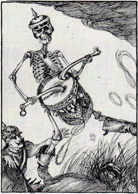
So what inspired Gooden to produce his highly unusual illustrations to FitzGerald’s text, most particularly his three Death plates ? Nothing in the succession of books illustrated by him gives any real developmental clue. Did the engravings for Revelation have any bearing on them? It doesn’t seem likely, as they are so different in nature. True, the onset of war might have lent more than just Biblical significance to the Four Horsemen of the Apocalypse for many, but there is no evidence that they held any such significance for Gooden, though it would be interesting to know why the projected edition of Revelation never came about. Still less does it seem likely that the war had any bearing on his approach to The Rubaiyat, for these illustrations relate to death in ordinary everyday life, not the violent deaths associated with war. Nor does it appear that there was a cluster of deaths amongst Gooden’s family and friends which might have prompted it. In the absence of anything else, therefore, I incline to the view that somewhere behind the scenes, Gooden was influenced by pictorial representations of The Dance of Death, which have a long and complex history extending from medieval times down to the nineteenth and even twentieth centuries (5). True, though Figs.2d & 2e find parallels in Holbein and Dürer respectively, Fig.2c does not so readily do so. However, the range of Dance of Death types is vast, with many variations on the theme having developed over the centuries. Compare, for example, Richard Dagley’s Death as a Gamester of 1827 (Fig.21a) (6a); Alfred Rethel’s Death Dance II of 1849 (Fig.21b) (6b); an illustration from Alfred Kubin’s Death Dance of 1918 (Fig.21c) (6c); an ink drawing of Death as a Night Watchman by Karl Ludwig Nagel, of c.1920 (Fig.21d) (6d); & Percy Smith’s Death Intoxicated of 1921 (Fig.21e) (6e) – and this is but the tip of an iceberg. Nagel’s Night Watchman illustration relates, though somewhat distantly, to Fig.2c, and Smith’s extraordinary view of the trench warfare in 1914–1918 will no doubt remind many readers of some of the illustrations in Edmund J. Sullivan’s little book The Kaiser’s Garland (London, 1915), both contrasting markedly with Fig.19! (Fig.21f shows one of Sullivan’s illustrations, “The Path of Glory.”) Sullivan, of course, used the figures of Death and Time in his illustration to quatrain 22 of FitzGerald’s first version (“And we, that now make merry in the Room &c” – Fig.21g), the lit candle held by Time presumably linking the scene to the night time death of the young woman depicted, and thus to Fig.2c. (It is interesting that Sullivan has symbolically placed the young woman’s death bed on top of a tomb.) Clearly, then, Gooden, and perhaps Sullivan, who used the figure of Death in no less than 9 of his 75 Rubaiyat illustrations, could have taken some inspiration from the wide spectrum of Dance of Death art, and turned it to Omarian ends. For me, the most telling detail in Gooden’s case is that his Death illustrations form a connected set, deliberately separated from the more regular frontispiece, whereas Sullivan’s do not form such a set, his 9 being embedded in the broader range of 75 illustrations. Why Gooden chose to hang Omar’s turban on a tree in Fig.2a, though, remains a mystery, as does that anchor (?) in Fig.2e.
[The illustrations can be browsed here.]
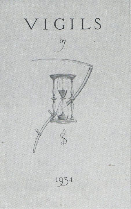
Vigils, a book of poems by Siegfried Sassoon, with a title page designed by Gooden (Fig.22) was privately published in 1934 in a limited edition of 31 copies, plus a further 272 copies whose title page retained the scythe & hourglass but lacked the “by” and the SS monogram of the poet (1h). In 1935 William Heinemann Ltd published a trade edition whose type–set title page read simply “Vigils / by / Siegfried Sassoon,” with no input whatsoever from Gooden. Why we have here a very limited edition within a limited edition, and why the scythe & hourglass couldn’t have been reproduced in the trade edition, as the Rubaiyat illustrations in the trade edition were reproduced from the engravings in the limited edition, I do not know, but there it is. The use here of the hourglass and scythe, the well–known symbols of Time and Death, is interesting, as neither symbol features in his three Rubaiyat Death illustrations. Their use here, though, was presumably prompted by one of the poems in the book, “The Hour Glass,” which Sassoon describes as “the memento mori glass” in line 6.
In The Times on 19 May 1949 (p.7, cols.6–7) The Folio Society announced its limited, numbered edition (1100 copies) of The Earliest Chemical Industry by Dr Charles Singer, Emeritus Professor of the University of London. The first 100 copies were signed by the author and bound by Sangorski and Sutcliffe in full morocco; the ‘cheaper’ remainder were unsigned and bound in scarlet buckram. The book was illustrated with reproductions of old woodcuts, engravings, drawings and paintings, and, the announcement continued, “STEPHEN GOODEN, R.A., has engraved an emblem for the colophon.” This rather smacks of the publisher using Gooden’s name to add, as they saw it, “a touch of class” to the proceedings, something which I myself regard as rather distasteful. Whether Gooden himself found it at all distasteful, or whether he just cheerfully accepted the fee, I do not know, but it does seem as if he was involved in more than his fair share of limited and very limited (not to mention expensive and very expensive) editions. Personally I find it rather sad that the last book which Gooden fully illustrated, in a readily available and affordable trade edition, was The Rubaiyat of 1940 (and even that had its limited edition.) Of course, this in no way detracts from my admiration of his skill as an artist, irrespective of the type of edition in which his work appeared. Indeed, I was spoilt for choice in selecting the illustrations for use in this essay and I am more than grateful to Campbell Dodgson (1a) for producing such a detailed overview of Gooden’s work.
It is clear from what has gone before – exclusive limited editions, bookplates commissioned by royalty, banknote designs, and his award of a CBE for the design of the George Medal – that Gooden moved in so–called ‘high society.’ In September 1948 he was commissioned by the Queen to design a tapestry of the Royal Coat of Arms, the finished product being delivered in December 1950. (Fig.1a dates from this period.) In 1952 he served on the Royal Mint Advisory Committee for the design of the new coinage required for the recently crowned Queen Elizabeth II. Again, in 1953, on behalf of the Institute of Metallurgists, the Duke of Edinburgh was presented with an intricate platinum and palladium powder box which had been designed for the Queen by Gooden (7). Make of those what you will.
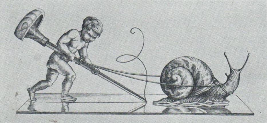
But to finish on a humorous note, Gooden was a copper plate engraver, a skilled and necessarily slow process. In 1932 he produced the engraving shown in Fig.23 (1i). It needs no further explanation.
Note 1a: For an excellent overall view with over 180 illustrations see An Iconography of the Engravings of Stephen Gooden, with Preface and Introduction by Campbell Dodgson (Elkin Mathews Ltd., London, 1944.)
Note 1b: For a good selection see Dodgson p.129–160. By way of examples, Gooden did bookplates for Stephen L. Courtauld (p.133), Katherine, Countess of Cromer (p.134), Geoffrey Keynes (p.137), and George G. Harrap (p.149). Notably in 1937 he did the small, medium and large bookplates for the Royal Library at Windsor Castle (p.152–4) and in 1942 the small and large bookplates for the Queen (p.181–2.)
Note 1c: He designed the set of new Scottish banknotes issued in January 1947 (The Times, 2 January 1947, p.7 col.2) and the new English £5 note issued in February 1957 (The Times, 19 February 1957, p.8 col.7.)
Note 1d: According to Dodgson (p.153), Gooden’s engraving of St. George slaying the Dragon, done for the medium sized bookplate for the Royal Library, Windsor Castle, mentioned in note 1b above, was used by Paul Kruger Gray on the reverse of the George Medal. It was apparently for this that Gooden was awarded the CBE in the Birthday Honours List of 1942.
Note 1e: On p.114–9. Dodgson also notes (p.120) that Gooden was working on an engraving of “The Destroying Angels”, but that it wasn’t finished and so wasn’t illustrated in his book. He described it thus: “Angels, forming an intricate pattern, attack the dragon’s seven heads,” which suggests it was to have illustrated Rev.12.7.
Note 1f: Dodgson p.5 says that the poem was directly inspired by the engraving, adding: “The suggestion for this interpretation of the design, as the mouthpiece of England at war, came from an admirer of Gooden, Mr Arthur Whitworth, at whose instigation the verses were composed.”
Note 1g: Dodgson p.x & p.67.
Note 1h: Dodgson p.100 says that the edition of 272 copies had “a simpler title page, ‘Vigils/by/SS (monogram)’” which had been engraved by Charles Sigrist (i.e. not Stephen Gooden), but this seems to be an error, for I have seen 5 copies with the title page retaining the hourglass & scythe, but lacking the “by” and the SS monogram, and signed by Sassoon as copies No.66, 75, 118, 184 & 231.
Note 1i: Dodgson p.13.
Note 2: See A History of the Nonesuch Press, by John Dreyfus, with an Introduction by Geoffrey Keynes & a Descriptive Catalogue by David McKitterick & John Dreyfus (The Nonesuch Press, London, 1981.)
Note 3a: By way of explanation, Peronnik is a simple orphan boy in the village of Saint–Jean–de–Braie who is destined to succeed in doing what no noble knight has, including Sir Gilles – namely, rescuing the Golden Bowl and Diamond Spear from the clutches of the magician Rogéar and his sister, the wicked sorceress Redemonde. The Golden Bowl and Diamond Spear, which had been brought from Palestine by the Crusaders, are, of course, the Holy Grail and Holy Lance of Arthurian Lore.
Note 3b: The novel was first published by T. Werner Laurie, London & Edinburgh, in 1916. Effectively it proclaimed that the Christian Faith was based on a lie, and that Christ was little more than a deluded madman. Lord Alfred Douglas sought to take Moore to court on a charge of blasphemy for holding up the Christian religion to “ridicule and contempt by suggesting that Jesus Christ was an ignorant, deceitful, violent–tempered and vain–glorious impostor”, but his application for a summons was turned down by the officiating magistrate. See, for example, The Globe, 6 September 1916, p.5, col.2 and The Daily Mirror, 7 September 1916, p.11 col.2.
Note 4: The British Library holds a set, listed as “St. John in Patmos; The Three Horsemen; The Rider on the Pale Horse” at shelfmark C.194.c.13.
Note 5: The Dance of Death originated in France in the mid–14th century in response to the ravages of the Black Death, its moral messages aimed at demonstrating the sinfulness which had led God to send the Plague, and at correcting the decline in morals of a populace who, facing imminent death, had decided to eat, drink and be merry rather too much for the Church’s taste. Having caught on throughout Europe, though, it continued to be relevant when applied more generally to the ever–present threats of famine, war and disease, not to mention death by accident. As a result, it diversified into numerous different forms, the strangest of which were the likes of Thomas Rowlandson’s satirical social commentary in The English Dance of Death, first published in 1815–6. Rowlandson included death by accident (whilst hunting or skating, for example) and also by over indulgence in drink: “Some find death by Sword and Bullet; / And some by fluids down the Gullet.” Again, in about 1912, Richard Cooper did a graphic series of paintings of Death visiting those suffering from a variety of fatal diseases – diphtheria, cholera, typhoid and syphilis, for example.
An excellent study of the whole field, medieval to modern, with ancient antecedents, is Leonard P. Kurtz, The Dance of Death and the Macabre Spirit in European Literature (Columbia University Press, New York, 1934.; Slatkine Reprints, Geneva, 1975.) It is unillustrated, unfortunately, and though much is devoted to literature, Kurtz also gives good verbal accounts of illustrations to that literature, and thanks to present day online sources it is fairly easy to locate much of the art work he mentions. Also of great interest is Frederick Parkes Weber, Aspects of Death and Correlated Aspects of Life in Art, Epigram and Poetry which ran through four increasingly large editions between 1910 and 1922, the fourth edition being over 800 pages long! It is now available as a Print on Demand book.
Note 6a: Richard Dagley’s Death’s Doings was first published in London in 1826, followed by a much enlarged edition in 1827, which ran to two volumes. The subtitle of the later edition makes its nature clear enough: “consisting of numerous Original Compositions in Prose and Verse, the friendly contributions of Various Writers, principally intended as Illustrations of Thirty Copper Plates designed and etched by R. Dagley.” Fig.21a represents the sad fate of a young compulsive gambler.
Note 6b: From Ein Todtentanz aus dem Jahre 1848 (A Dance of Death for the Year 1848), illustrated by Alfred Rethel, with commentary by Robert Reinick, published in Leipzig in 1849. This was one of six such prints produced by Rethel in the aftermath of the widespread revolutionary upheavals of 1848. Fig.21b shows Death galloping towards a town clutching his scythe and a set of scales, the latter (like those in Fig.16b) presumably denoting approaching death by famine rather than the weighing of souls.
Note 6c: From Ein Totentanz von Alfred Kubin (A Dance of Death by Alfred Kubin), a book of 24 drawings, first published in Berlin in 1918, but with later reprints. Titled “The Rich Man”, Fig.21c appears to depict Death as a well–dressed woman playing a tune for the dying old man, the message presumably being that death for the rich is still death, however you look at it.
Note 6d: This appears to be one of a set of at least three such drawings by Nagel, though only one is signed, the other two being rather crude in execution compared with other works by this skilled artist. However, the figure of death in Fig.21d does bear a strong resemblance to that in the more skilled signed drawing.
Note 6e: Percy Smith had made various realistic sketches during his service in the trenches during World War I. It was only in 1921 that he published a portfolio of 7 etchings which translated his wartime experiences into a modern “Dance of Death – 1914–1918.” Only 100 sets of these were issued, so they are now very rare and expensive. Fortunately there is a set in the London Library (under Art: Shelfmark “A. Etching, folio”) and Campbell Dodgson (compiler of Gooden’s Iconography) left an account of them in Print Collector’s Quarterly, October 1921, p.323–6.
Note 7: For the commission for, and delivery of, the tapestry see The Illustrated London News, 25 September 1948, p.23 and 2 December 1950, p.11, respectively. For the Royal Mint Advisory Committee see, for example, The Scotsman, 21 March 1952, p.6, col.4. For the powder box see The Times, 20 October 1953, p.5 col.4.
**********
I must thank Teodora Udrescu and Antiquariat Steffen Völkel GmbH for supplying information about the drawings of Nagel and for the image used in Fig.21d. I must also thank the following for their help in various ways, for information about editions of The Rubaiyat in their collections, thoughts on Gooden’s illustrations, and general proof reading etc: Fred Diba, Joe Howard, Sandra Mason, and Roger Paas.
**********
To return to the Notes and Queries Index, click here.
To return to the Index of the Rubaiyat Archive, click here
.